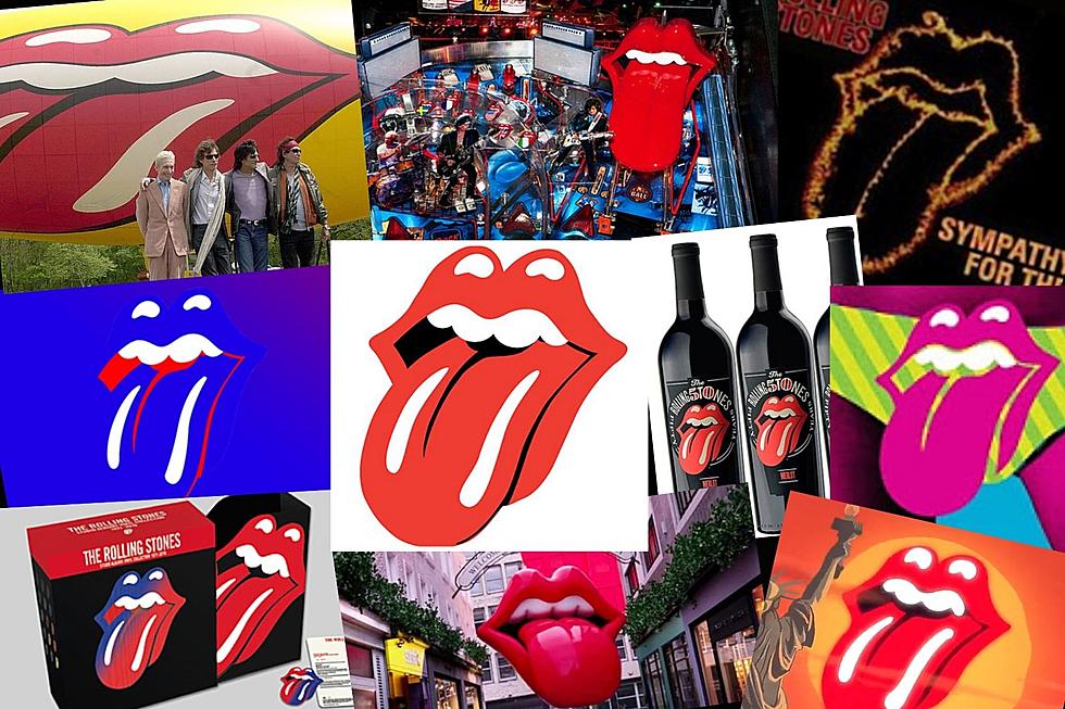
How the Rolling Stones’ Tongue and Lips Logo Was Invented
Five decades on from its creation, the Rolling Stones logo is now one of the most recognizable symbols in the world. But it began as a simple, small emblem.
In 1970, the Stones were seeking a poster design for their upcoming European tour and, unhappy with the options offered by their label, reached out to the Royal College of Art in London, where student John Pasche was studying. Recommended by his professor, Pasche was asked to design the poster, as well as - according to a letter sent to Pasche from the Stones' London office - a "logo or symbol which may be used on note paper, as a program cover and as a cover for the press book."
"I often thought, 'Why me?'" Pasche later recalled of being asked to take on the project. "This particular tutor who took the call thought my work was most suitable, as I was doing a lot of pop art, so my images were quite bright."
At first glance, the tongue and lips logo that was ultimately created would appear to be an iteration of Mick Jagger's own dramatic facial features, but that wasn't the intention, according to Pasche. When the artist first met with the singer to discuss design ideas, Jagger said he was intrigued by the tongue of the Hindu goddess Kali, an idea Pasche shied away from. "I didn’t want to do anything Indian, because I thought it would be very dated quickly, as everyone was going through that phase at the time," he explained.
But the image of the goddess' mouth struck Pasche: "When I saw that pointed tongue, it just clicked! You know the way kids stick out their tongues if they want to be nasty? It's a way of being anti-authority and rebellious." Any resemblance to Jagger was secondary. Pasche later told the Victoria & Albert Museum in London that his main goal was “to represent the band’s anti-authoritarian attitude, Mick’s mouth and obvious sexual connotations,” while also creating an image that could be “easily reproduced and in a style which I thought could stand the test of time”.
It's done that and more. Following its debut appearance in the inner label of the band's 1971 album Sticky Fingers, the tongue-and-lips logo made its way onto just about every piece of Stones-associated merchandise — from posters and T-shirts to the side of the band's tour plane. "In my opinion, the Stones’ tongue logo is the most iconic, potent and enduring logo in rock 'n' roll history," artist Shepard Fairey said to Rolling Stone in 2012, when he was tasked with reimagining the logo for the band's 50th anniversary. "I think the logo not only captures Mick Jagger’s signature lips and tongue, but also the essence of rebellion and sexuality that is the allure of all rock 'n' roll at its finest."
As successful as the logo became, Pasche at the time never considered the job a particularly life-changing one. He charged the band £50, a strikingly small sum considering that in 2008 his original artwork featuring the logo sold at a New York auction for $92,500. "It was not a big deal at the time for them and only took me a week to do, hence why I only put in a small invoice," Pasche said. "If only I had known then how it would develop in the way it has and still be around now."
The Rolling Stones' Charlie Watts Year by Year: Photos 1962-2020
More From 100.7 KOOL FM


